Quench - Sample Project
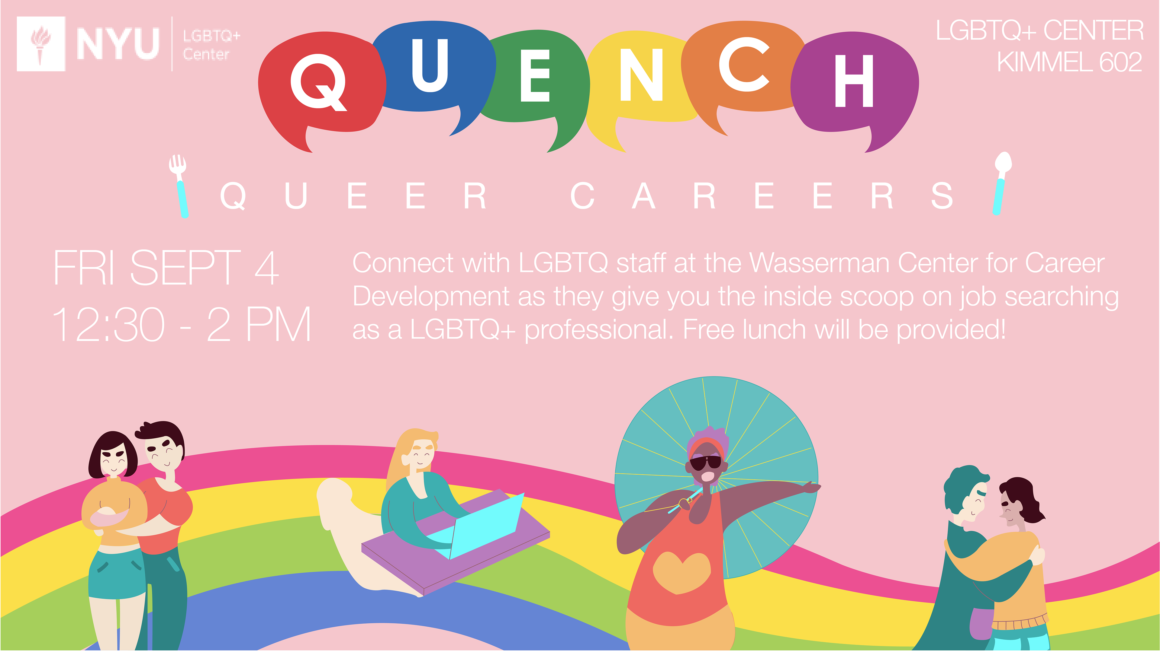
I created this advertisement design with the event and discussion topic in mind. My characters are inspired by some of the most popular jobs–civil rights lawyer, adoption caseworker, event organizer/promoter–to have as an LGBTQ+ professional and were designed to represent them. I wanted to adopt the rainbow flag somewhere onto the design while still keeping the color scheme warm and inviting, so I tweaked the colors to feel brighter instead of bolder. Lastly, I changed the original diamonds of the 'QUENCH' logo in order to showcase that this event is for discussion and conversation about career opportunities in the LGBTQ community.

Quench - October
For October's design, the assignment was to use the same Quench template I had created in August but with a red background and an illustration geared towards a citywide Queer community. With that in mind, I chose a less saturated red and instead went towards a watermelon-pink direction. As for the graphics, I decided an ambiguous skyline–with elements that both belong to day and night–could appropriately represent a lunchtime discussion about queer inclusion in the city.
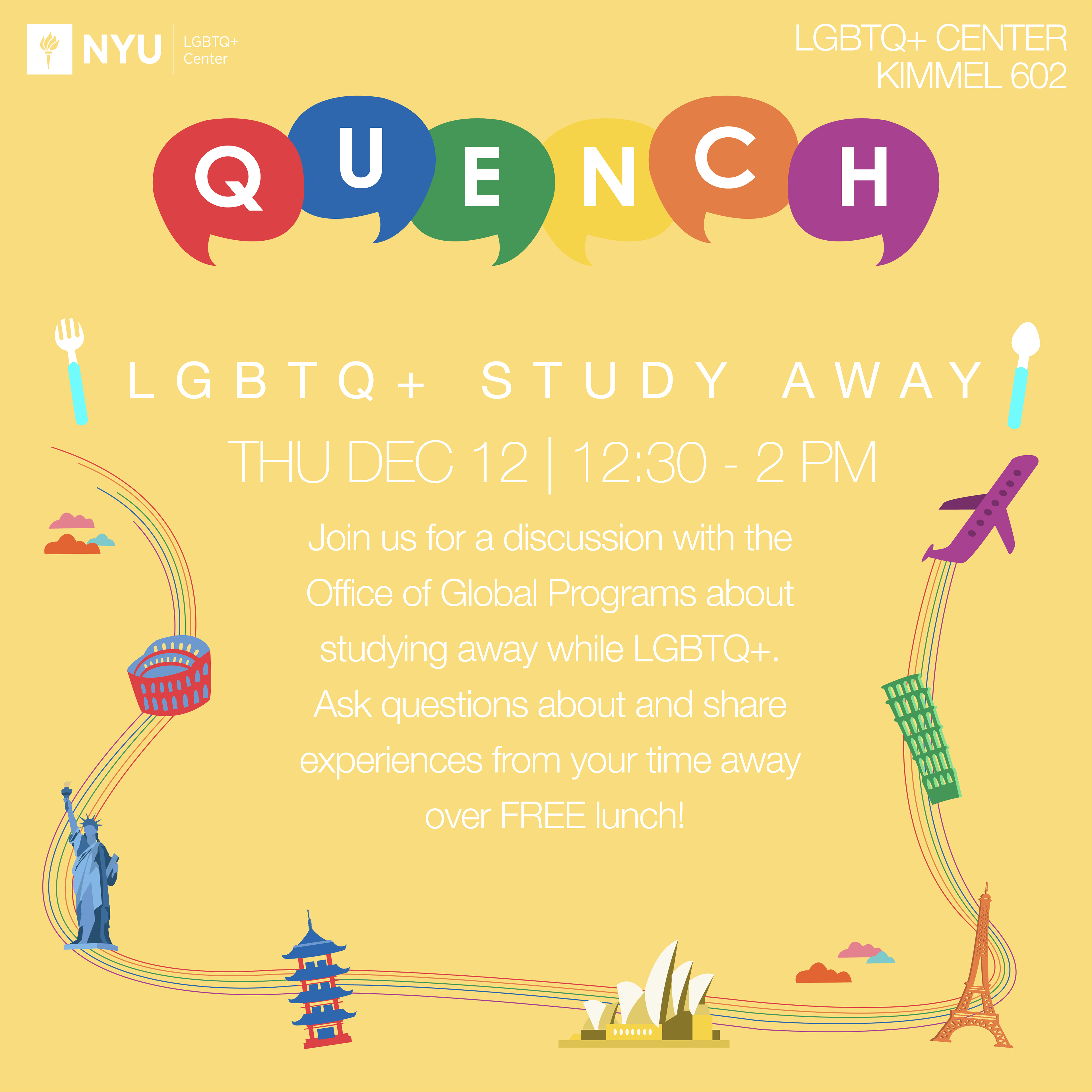
December's design was targeted towards those in the community interested in studying abroad. The color scheme was yellow (Orange was November, but that graphic was unneeded as Quench became a Trans Awareness Week event), so I created a rainbow path that connected different landmarks across the world. This included monuments such as the Statue of Liberty, Colosseum, and Eiffel Tower.